

Introduction
In the realm of streaming services, Prime Video by Amazon stands out with a vast collection of movies and TV shows that cater to a wide range of audiences. As a data enthusiast and an aspiring data analyst, I embarked on a project to visualize this immense library using Microsoft Power BI. This blog post walks you through my journey of creating a dashboard that not only serves as a data visualization tool but also tells the story behind the numbers.
The Motivation
Data is everywhere, but without the right tools and techniques, it's just numbers without a narrative. My goal was to bring the data to life, to provide insights at a glance, and to uncover the trends in Prime Video's content that could potentially inform strategic decisions.
Data Collection and Cleaning
The first step in any data analysis project is to gather and clean the data. For this project, I obtained a dataset containing details of titles, genres, directors, ratings, and more. I meticulously cleaned and prepared the data, ensuring it was accurate and suitable for analysis.
Building the Dashboard
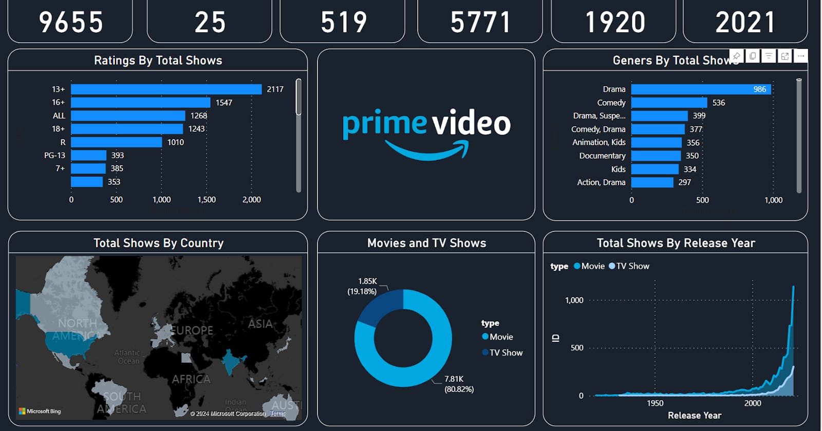
With clean data in hand, I turned to Power BI to start building the dashboard. Here's a breakdown of the key components:
Total Content Metrics: Summarizes the sheer volume of content available on Prime Video.
Ratings by Total Shows: A bar chart that segments shows by their age suitability ratings.
Genres by Total Shows: Shows the most popular genres, providing insight into audience preferences.
Total Shows by Country: A world map indicating the diversity and global reach of the content.
Movies vs. TV Shows: A donut chart that offers a quick view of the content type distribution.
Total Shows by Release Year: A line graph that depicts the growth trajectory of Prime Video's content over the years.
Insights and Observations
The dashboard revealed several interesting insights:
There has been an exponential increase in the number of titles offered, particularly in the past two decades.
Drama is the most popular genre, indicating a potential area of focus for content creators.
The majority of content is targeted toward viewers aged 13 and above, suggesting a strategy geared towards a more mature audience.
Challenges Faced
The journey wasn't without challenges. From dealing with missing data to ensuring that the visualizations were intuitive and informative, I learned valuable lessons in data visualization and dashboard design.
Conclusion
This Power BI dashboard project was not just an exercise in data visualization but also a lesson in storytelling. It's a powerful example of how data, when visualized effectively, can provide actionable insights and tell a compelling story.